OVERVIEW
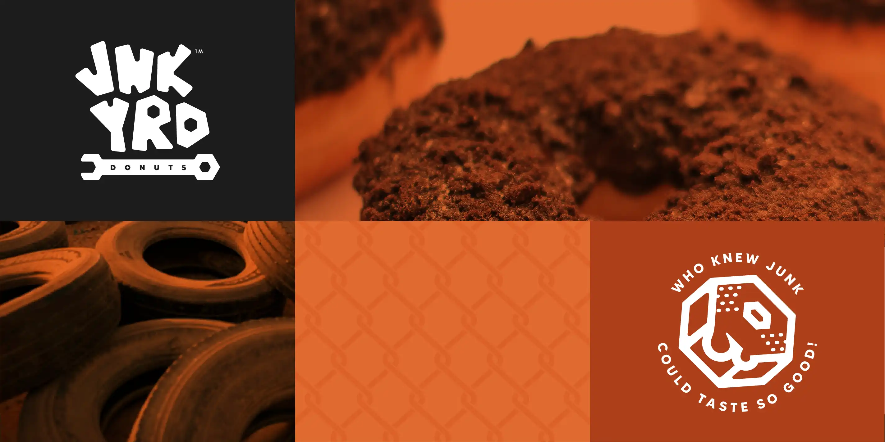
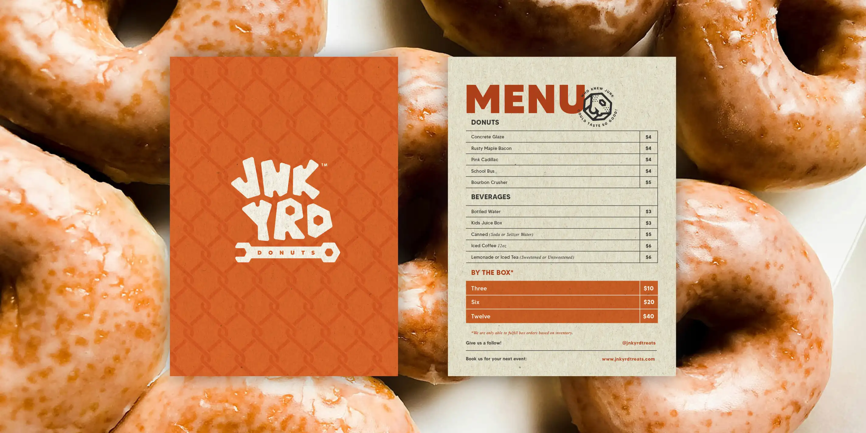
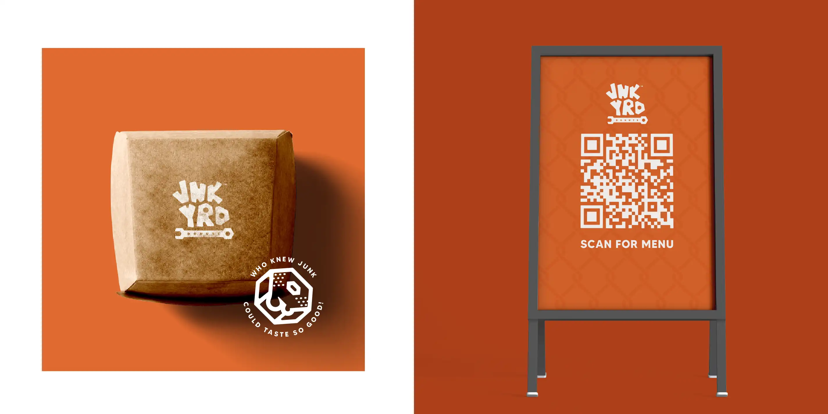
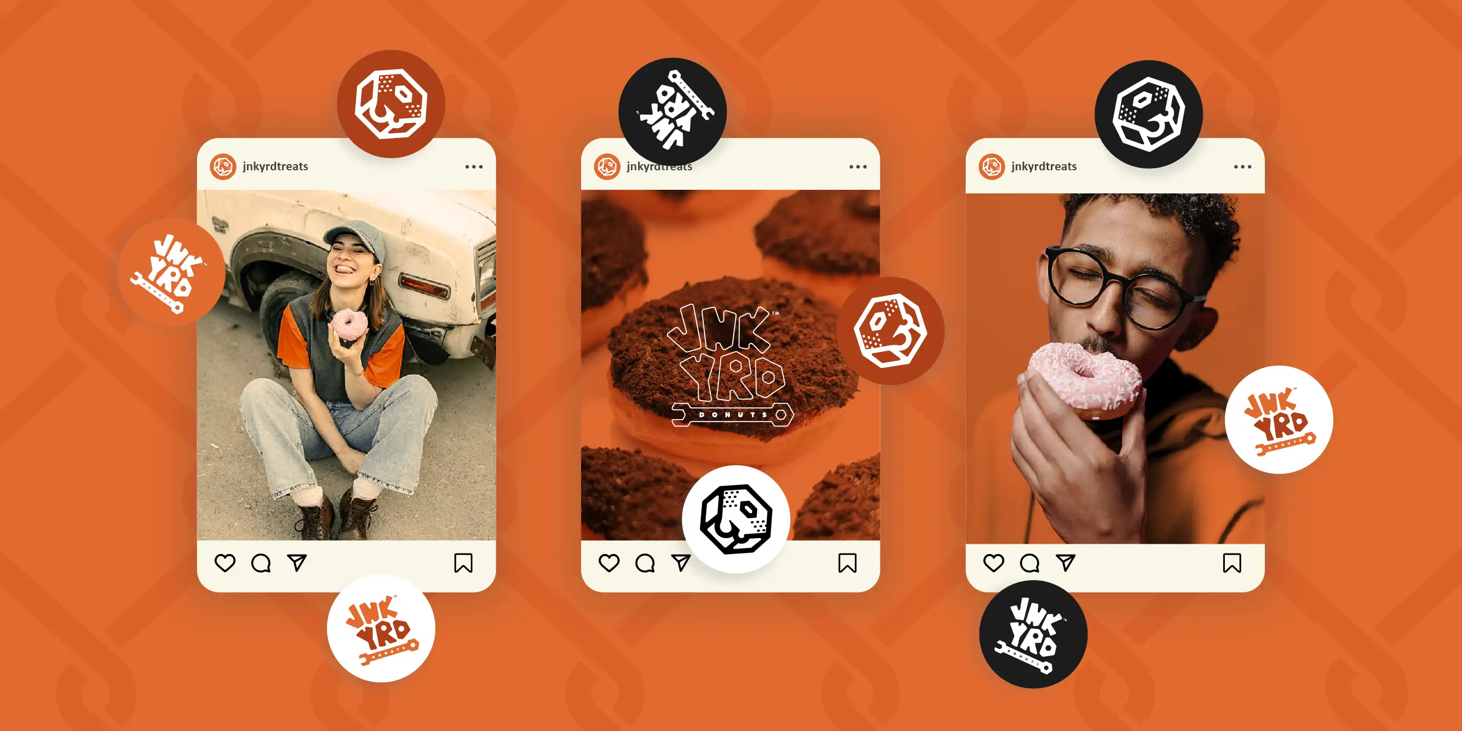
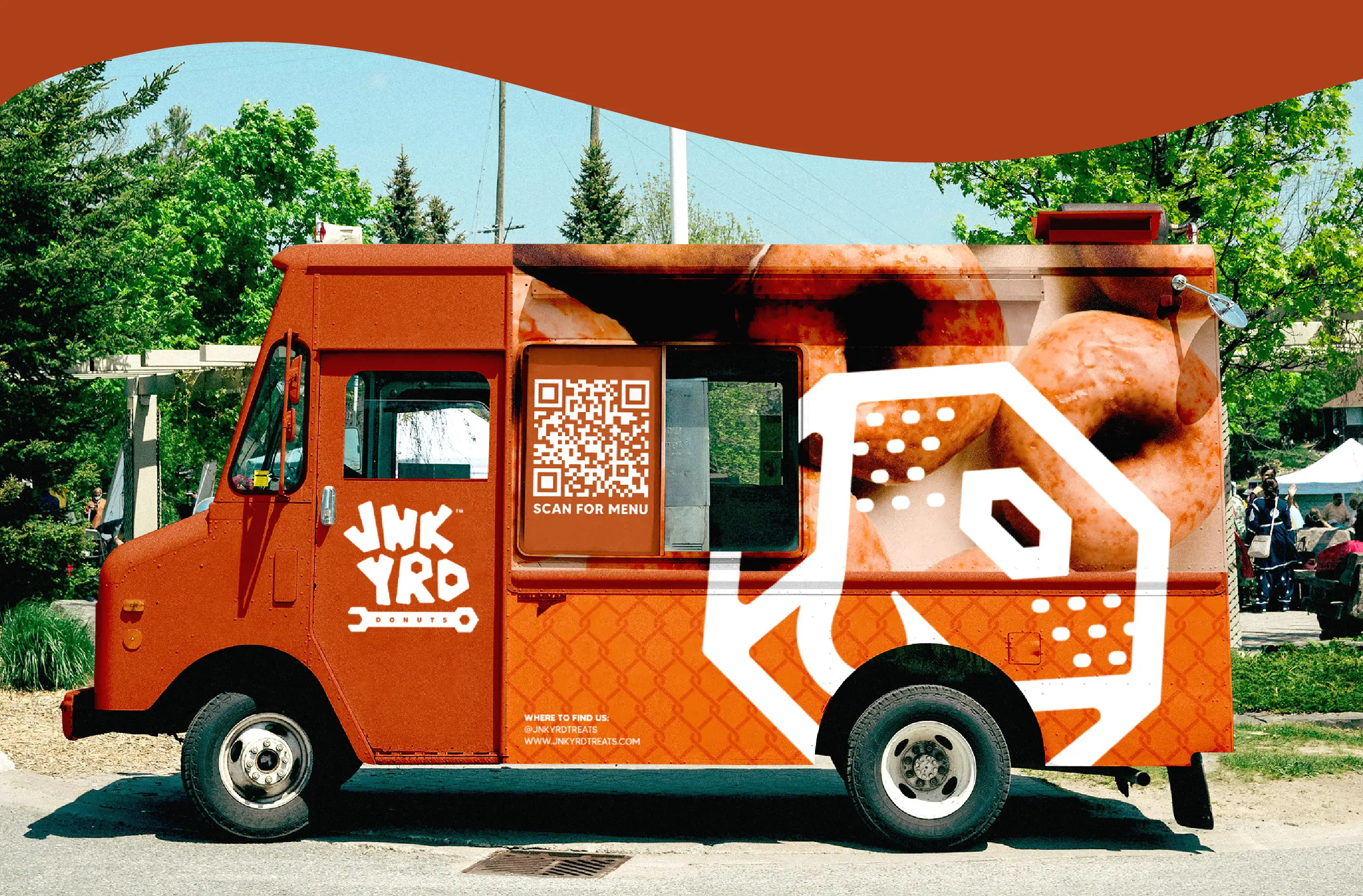
JNK YRD Donuts is a junkyard themed food truck business that caters to a broad, family friendly audience. With this in mind, branding was aligned with a bright and fun aesthetic juxtaposed against the rough and industrial characteristics of a junkyard.
CONCEPT
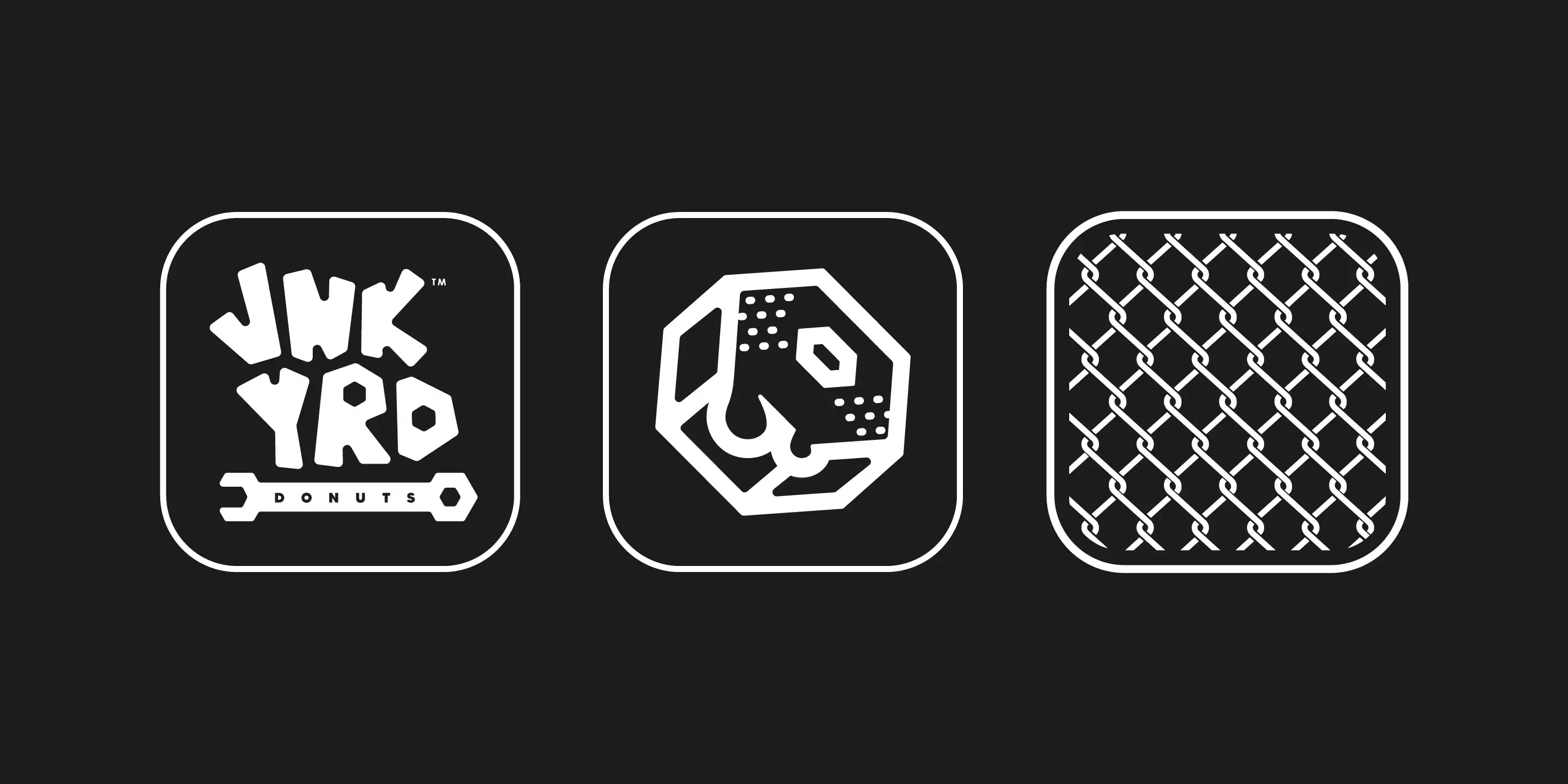
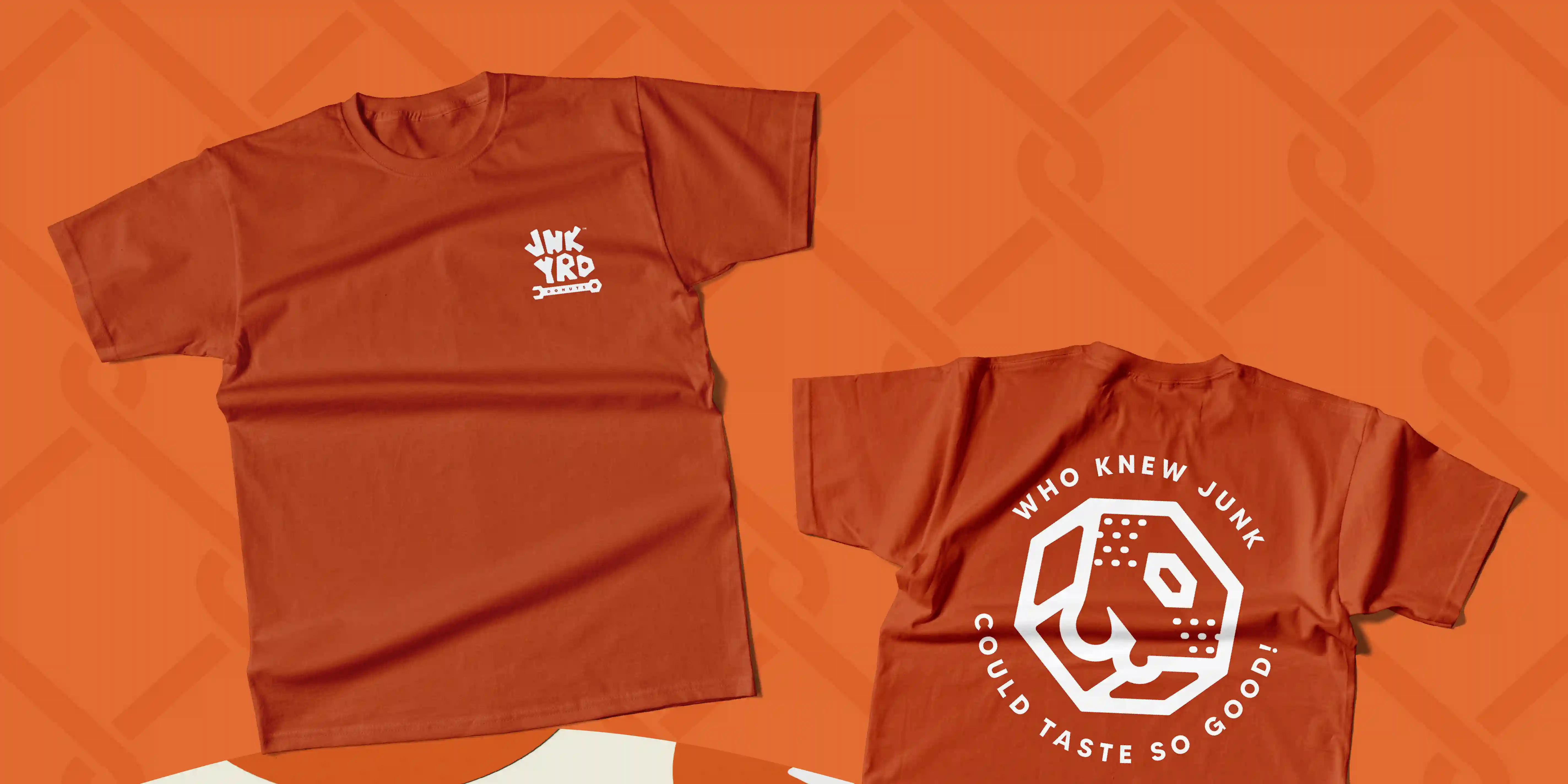
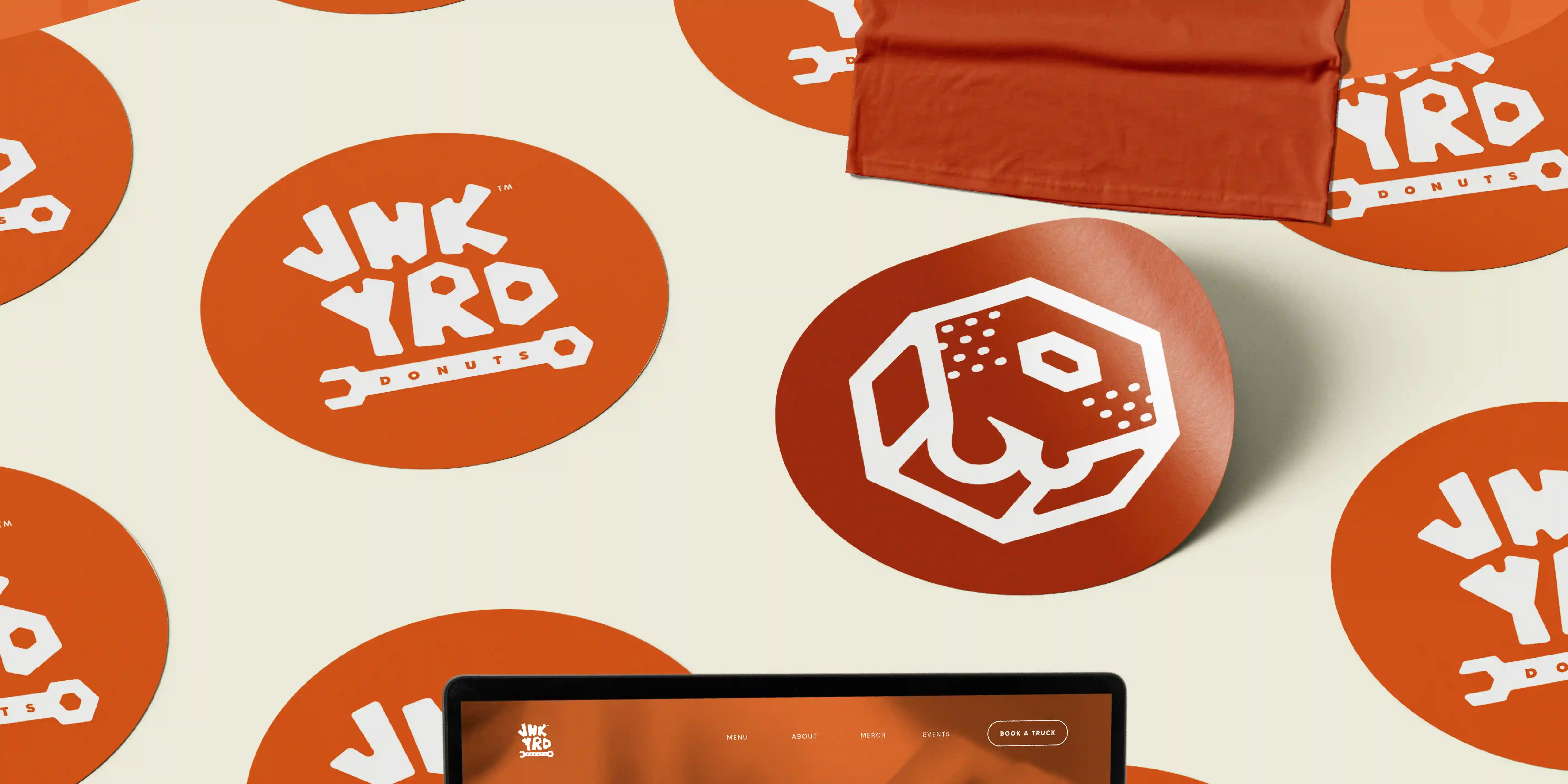
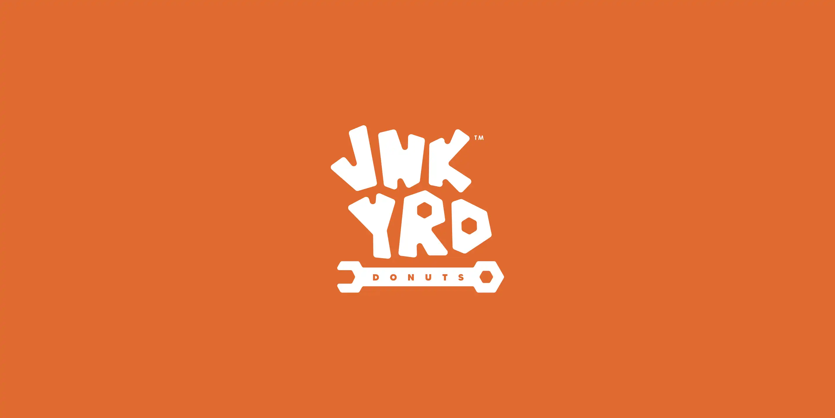
To amplify the brands playfulness, I opted for an organic hand-drawn wordmark as the primary logo. Letter counters were replaced with hexagonal shapes to tie in to the underlying wrench graphic and consistent theme entirely.
In order to expand their identity, a secondary logo was created by conjoining a hex nut and donut as a clever and symbolic way to visually connect to customers. Lastly, a chain link fence pattern was created to add subtle cues and visual interest where applicable.